Hey folks, I’m pretty excited to announce this.
Ever since Renu Sharma took over as my cover artist after “Hunt of The Bandham” it has bothered me that my first series, “The Moonrat Saga”, didn’t have a consistent cover design. Her work on The Jharro Grove Saga was so good, with each cover feeling tied together with the rest, that I wished I could do something similar with my first series.
Finally I spoke with Renu broached the idea of redoing the covers of those first six books. I didn’t want a complete overhaul. I loved the artwork itself. But I wanted the lettering to be more cohesive and consistent across the saga. Renu agreed and has been working on the project for a little while now. Finally, she sent me the finished project and I have to say, I love it.
Now you may think that the covers aren’t hugely different and you would be right, some of the changes are subtle, but what she did was make the overall series more professional looking and I love the little added touches, especially in the full paperback covers. I like having the volume number on the spine.
What you’ll see below is the old cover, followed by her redesign and the full paperback version. You can click on each photo to enlarge.
Please comment below. Tell me what you think!
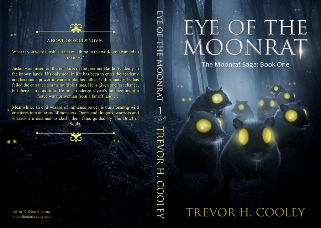
Eye of the Moonrat:
Old design:
New Design:
Paperback:
Hilt’s Pride:
Old version:
New Ebook:
New Paperback:
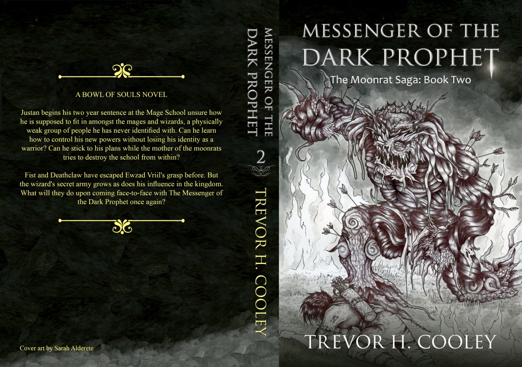
Messenger of the Dark Prophet:
Old Version:
New Ebook:
New Paperback:
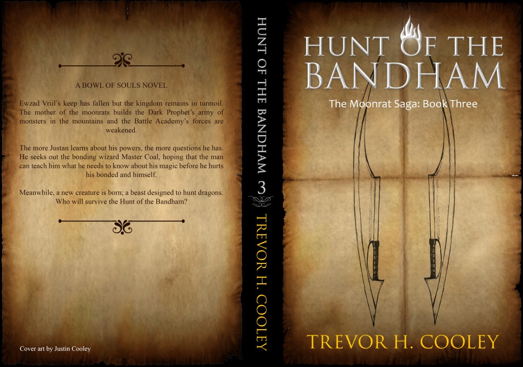
Hunt of the Bandham:
Old Version:
New Ebook: (I love the flames over the O)
New Paperback:
The War of Stardeon:
Old Version:
New Ebook:
New Paperback
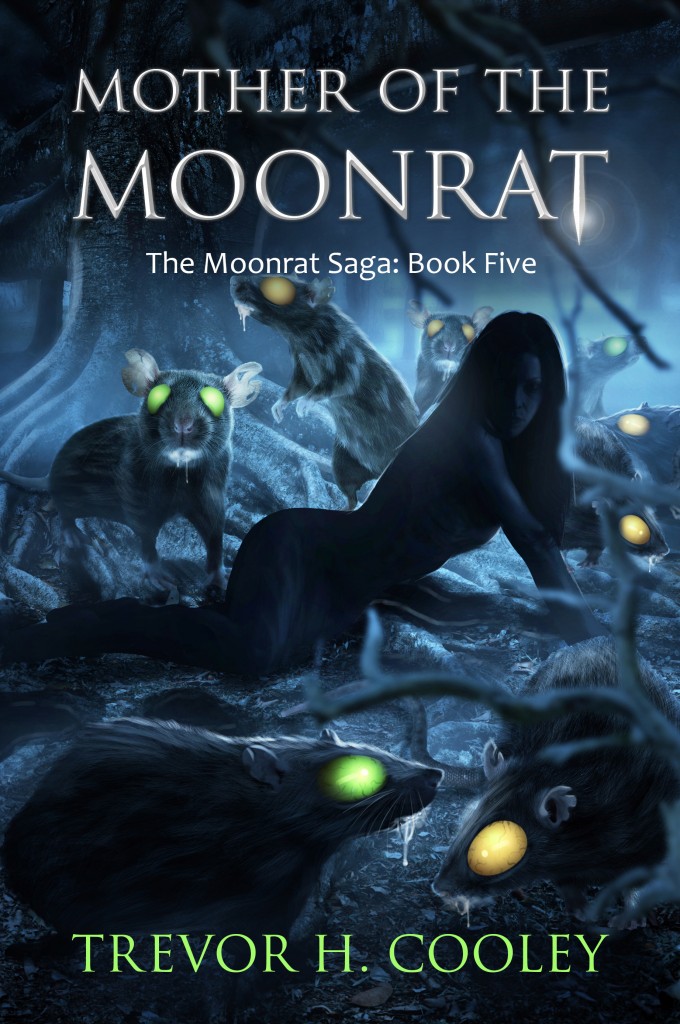
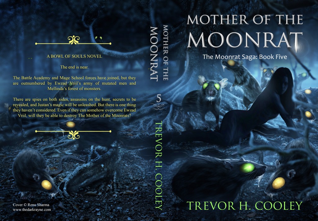
Mother of the Moonrat:
Old Version:
New Ebook:
New Paperback:
I have uploaded the new cover art to Amazon and to Createspace for the paperback versions. The new covers should be available in a few hours.



![Pageflex Persona [document: PRS0000038_00057]](http://trevorhcooley.com/wp-content/uploads/2015/07/HP-ebook-679x1024.jpg)


![Pageflex Persona [document: PRS0000039_00011]](http://trevorhcooley.com/wp-content/uploads/2015/07/MOTDP-ebook-679x1024.jpg)

![Pageflex Persona [document: PRS0000039_00011]](http://trevorhcooley.com/wp-content/uploads/2015/07/HOTB-ebook-679x1024.jpg)


8 Responses to Cover redesign for The Moonrat Saga